The Design Constraints
This redesign task had many design constraints as the backend/back office for the e-commerce was already created/developed and the company did not want to make changes to the backend as they were also constrained by time.
It is also important to note the business goal for this product as that impacted the thoughts and insights behind different design choices. The business goal was for the company to sell the product (the e-commerce site and the back office) to other companies to run their own e-commerce business. This meant that companies could upload their banners, products, icons, etc from the back office.
The constraints were as follows:
Large banners would be a carousel and smaller banners would be static.
Category icons are only limited to the first level and currently have not catered for sub-categories icons.
There were no features like review and rating developed yet, so they could not be added to the design.
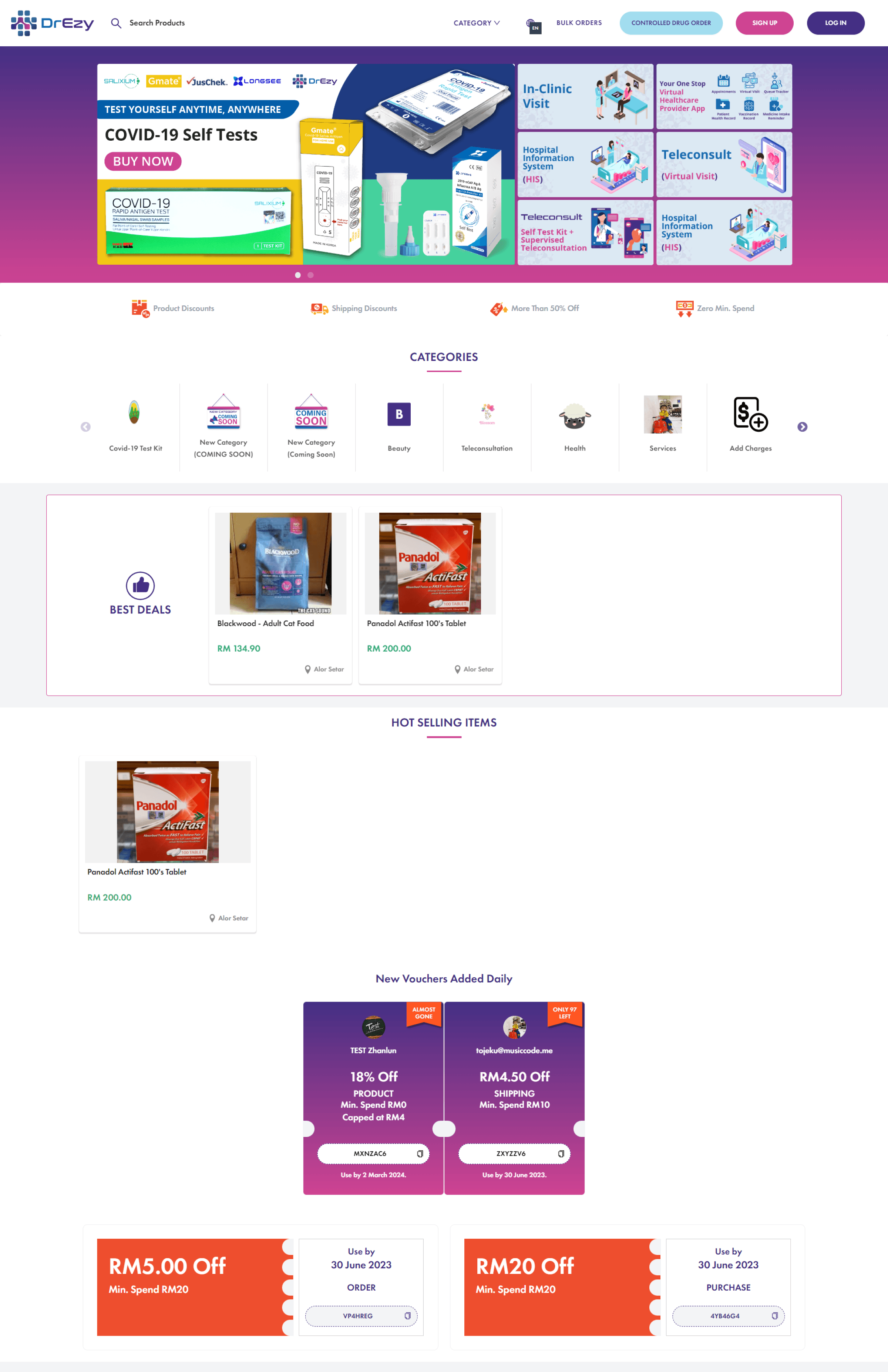
The Before
The Changes Made
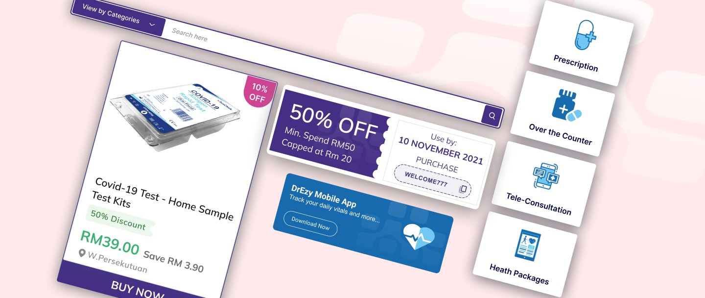
Search Bar
The search bar in the current design was not very visible. Having read many case studies and user research by my fellow UIUX designers around the world, it is known that the search bar in an e-commerce website is one of the most important features as users tend to search for the products they have in mind rather than find them by browsing through. Hence, the search bar had to stand out and be easily accessible.
I decided to have the search bar right below the header so it can be bigger and the background can be highlighted to bring the user's attention to the search bar. I used the colors for the background and buttons from the brand theme they had already set up.
Categories
For categories, I had chosen to display two types of category selection. One, a detailed list view of the categories to select from and another to display just the main categories with icons as they already had this function built in the back office.
Here, I decided for the category dropdown to be on the left-hand side of the search bar as most e-commerce sites here in Malaysia had theirs on the left as well, so this will keep the user experience similar and not confuse our users.
As for the main four categories, the decision to display them not only made it easier for the customer to decide which category to select if they intended to browse by category, but it also immediately communicates to the customer the nature of the products that are sold by the site.
Product Card
For the product card, there were already a few glaring enhancements that could made.
Firstly, the background for the image frame was set to white, this is a minor change but it creates a huge impact on the UI design as all product cards will look clean and standard rather than the gray background they currently had.
I also made the title to be left aligned and two rows as some products could have a long product name.
Since the title was already left aligned, everything else had to be left aligned as well to keep the consistency.
Below the title, I included a small discount ribbon followed by the price and how much the user will be saving if the discount was applied.
They already had the location displayed and wanted to keep that, so I just moved it to the left as well.
The “BUY NOW” button only appears when the user hovers over it as it helps and prompts the user to make a decision.
Banners
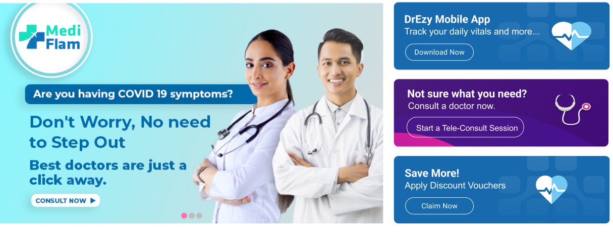
As mentioned previously, there were constraints for the banners. Designing with that in mind, I came up with:
Banners must be large enough for the customers to read their content. So, I decided on this arrangement for a few reasons:
1. It is known that most users read from left to right, so naturally, a user’s attention would go to the left of the screen first, and placing the large banner on the left, would now increase the chances for the user to read or view that banner.
2. I decided on three smaller banners as they would not only be large enough for the users to read but also keep a good and equal amount of spacing between all banners.
Discount Vouchers
The discount vouchers were quite simple to deal with as they already had a good basic design in place.
For the discount vouchers, I just improved on the font sizes and spacings. I also added the company logo in the background just to enhance the branding of the company providing this vouchers.
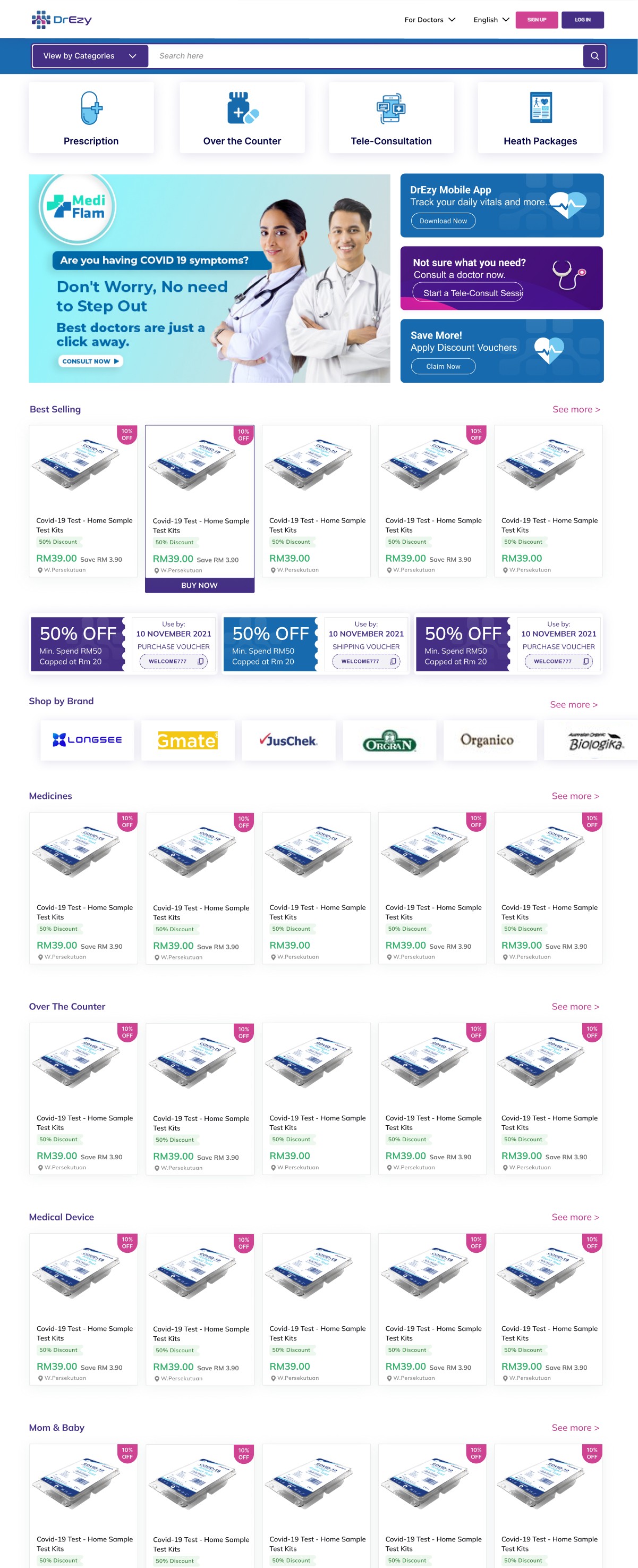
The Solution at a Glance
The discount vouchers were quite simple to deal with as they already had a good basic design in place.


